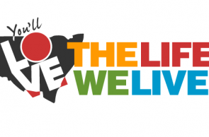
A selection of colour variations have been provided based on the comments from the last round of voting. Please select your preference and provide comment on your selection.
NOTE: Colours can vary due to different system settings and screen variations. To limit this problem web safe colours have been used to ensure (as best as possible) a consistent display.
If you would like to make comment on colour alternatives please use the web safe colour chart
Process (same as previous voting)
- Each design can be enlarged and viewed by clicking the thumbnails below.
- When viewing the designs in the ‘large format view’ there is an option to make comment on the individual designs.
- Overall comment can be made on the blog post below. There is a reference number placed on the bottom left corner for identification.
- To determine preferences I have provided a voting option for each concept. You can select your preference by clicking the ‘Like’ symbol underneath each design in the thumbnail view below. Only one vote per person.


My brains trust says the multi-coloured.
Hi all –
I completely understand where everyone is coming from. I think it’s important to keep in mind that with the multicolour version there is, as Megan pointed out, a greater range of possible avenues to go down in terms of future creative. This is an opportunity and risk, if not executed correctly, as we could also, by having too many option, fall into the trap of not being consistent.
On seeing the colours my first thought was Dubbo branding (although Dubbo’s are decidedly different/more vibrant tones). http://www.dubbo.com.au/ They’ve handled the use of multiple colours well by very clearly using each colour to denote a section/theme of the website/life in Dubbo. I am not 100% but believe this carries through all of their collateral. Choosing 4 colours now may (and should) impact how we structure our content.
After a lot of back and forth and discussion with other people in my office, I am going to also agree with the multi-colour. Apparently blue and orange are Armidale colours. And I have to agree that the ones with blue and green do look a little bit corporate.
The multi-colour gives us lots of room to move with future creative in terms of colours used etc.
Re: Aileen’s comments – I thought the ‘o’ of ‘love’ was actually supposed to be indicative of our region?? I think it’s actually a really good feature, and one of the reasons I like it so much. And if we want to delve in to it, the ‘o’ could also stand for Orana.
Just a quick note though – should the word ‘love’ be wholly in red or some other colour? At first glance, it could just say “the life we live”?
I agree with Lee. See where the voting comes and then go from there
I’m not sure if I am just reading into things but I also think it is the colours of our landscape in a more exiting version that the traditional ochre shades. I may have just not had enough sleep over the weekend are seeing things
Glad you picked up on that Randall. The colours are loosley based on this image with the inclusion of red. Although the image is not representative of the whole region I felt the colours adequately represented the range ok.
After all my complaining I think I would prefer the multi colours as well .. but I am also a bit concerned that the O in Love looks like it is a depiction of the boundary we are working on .. it is the only letter filled in .. I know its the only one you can fill in .. perhaps the word LOVE should overlay the whole state as one line not 2 .. maybe colouring the O in yet another colour .. ?? the lime green .. my second choice is the one beneath which is blue and lime green.
I’ve picked the multi colours just because it’s different and the words stand out rather than the state. Otherwise blue and orange are lively.