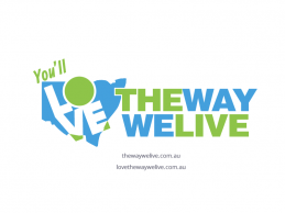
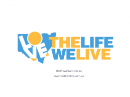
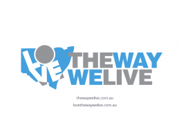
4 logo concepts have been provided below, along with some additional variations. I have provided some variations of the preferred brand name which I would like comment on, as the final concept may be a combination of design and variation. I have included available domain name options with the images as this is an important factor determining the most suitable option.
Note: I will be providing refined iterations of the preferred logo.
Process
- Each design can be enlarged and viewed by clicking the thumbnails below.
- When viewing the designs in the ‘large format view’ there is an option to make comment on the individual designs.
- Overall comment can be made on the blog post below. There is a name reference to each design at the bottom of the ‘large format view ‘ for identification e.g. ‘Logo4b’.
- To determine preferences I have provided a voting option for each concept. You can select your preference by clicking the ‘Like’ symbol underneath each design in the thumbnail view below. Only one vote per person.

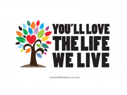
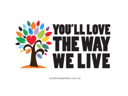
Sorry to throw a spanner in the works – I’m with Randall in preferring the tree versions. I agree that the others look too corporate/government like for me. I think the tree stands out instantly – is a bit quirky and would have wider appeal with the use of the bright colours. I also think it emphasises our key messages “love, life, live”.
It seems to be that the last set is the popular. I’m fine with this, I did vote for one of the trees. The vibrancy of the tree is what appealed to me. I don’t want that green in any of our logos. I think it has been used in the Expo and also in other “change” campaigns. Also it look like a government, conservative type bland colour.
I think Alieen might be right and there is some work need around the colours. Although I am out there on my own on the tree (happy to go with the majority) I think the vibrancy of it is something we shouldn’t overlook. This is motivational not a corporate brand to put on business shirts. I really think two colour just does not feel exciting enough for what we are about.
I am happy with the logo set with the map, can we see it with 4 or 5 colours.
Thanks
Randall
Sarah and I would choose the 7th logo You’ll Love The Way We Live
We think the inclusion of the map is good as it connects to the purpose of our group. The location of the letter “O” is actually near to where we are located too which is a bit like X marks the spot. We are not a fan of the trees as I feel trees are used very often in logos.
Regarding the colour palette of the 3 state logos we prefer the Blue and Green as the blue and green give feelings of being outdoors and since yellow is the most difficult colour for the actual eye to take in and grey is a conservative colour. The blue and green colour palette also ties in with the great western plains guide which Coonamble, Dubbo, Gil, Narromine, Warrumbungle and Warren are in. The boldness of the colours are good as it attracts your attention.
I am liking the inclusion of “You’ll” into the 7th logo .. but not fussed on any of the colour pallets used .. while I like blue and green I think this green is too .. something .. ?artificial .. and I would prefer to see gold but then again do not like the gold .. so will go with majority choice on this one as long as its the bottom 3 logo’s with a change from “way””to “life” .. as far as a domain name .. happy to go with the one Georgia is recommending ..
Prefer the bottom images as it gives a visual of where we’re talking about and the others look a bit ‘off the shelf’. I like the blue and burnt gold better (we have more sun and blue sky than green grass!). I agree re Live, Life, Love as hook words. Still think ‘Love the Life YOU Live’ or ‘Live the Life YOU Love’ is more to the point than ‘You’ll Love the Life We Live’. It’s all about their life, not ours.
Good progress guys, thanks.
I am pleased Georgia is on the team. Am happy with those and Megan’s suggestions. Good job Drainey. looks great.
Cheers
Phil J
Hi All,
Great work Andrew, thank you!
Georgia, I agree with all of your comments, and the preferred logo style – the blue and green is my preferred also, but agree that it should be “You’ll love the life we live” rather than ‘way’.
lovethelifewelive.com.au would be my preference on domain.
Here are a few of (Sarah and my) thoughts.
– The colourful tree is great and attention grabbing. However, I think the state logos are more relevant to promoting the region as they put the slogan in context. Also, if the logo was ever to be changed to just show the tree on its own, it would be hard for people to associate it with relocating to the Orana.
– Regarding the slogan, I like the idea of “love/life/live” using the alliteration as it is catchy. I also think the word “life” is better than “way” as it represents a lifestyle rather than just a process. Also, (as I think Lee has already suggested) I think it is important to use the word “you’ll”, as putting “you” and “we” in the same sentence makes the statement more inclusive. The word “you’ll” in the blue and green logo provides a starting point for the eye to read the slogan left to right so I think it is important for visual purposes too.
– If we were to choose a domain name based on “you’ll love the life we live”, I think lovethelifewelive.com.au would be fine.
– Regarding colours, I would suggest including green as it signifies the natural beauty of our region and also is a positive colour for people within the region. Blue is a good complementary colour as it could signify rivers, blue skies etc.
– I think that Image 1 is a bit too close to the Community Mutual logo, and Image 2 looks like it could be a sign for a housing development rather than a regional promotion.